
Fixing what was quietly costing RomperJack sales
An 8-year-old premium Shopify store couldn't update its theme without breaking, and its product page was losing buyers every day. Here's how we sorted out both, starting with what real shoppers were actually doing on the site.
69K+
User sessions reviewed~80%
Mobile-first traffic7
PDP friction points fixedRomperJack
RomperJack is a US men's brand that sells rompers and jumpsuits directly to shoppers. It has been running for 8 years on a premium Shopify theme and has built a loyal following over that time. When the current owner took over about a year ago, he had a nagging sense the store was leaving sales on the table, and he was right.
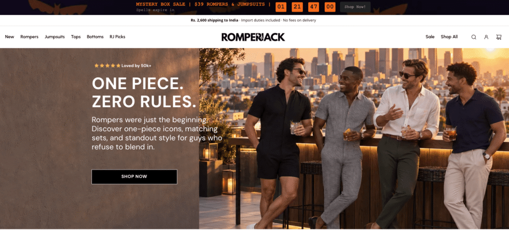
Two problems, one store
RomperJack came to us with a technical headache and a conversion problem. The two were quietly making each other worse.
Theme updates kept breaking the store
Years of custom code had piled up on the premium theme. The catch was that Shopify's "one-click" update didn't blend those changes in. It reset the theme and wiped the customizations every single time. So the owner was stuck with two bad options: update and break things, or never update at all. What he actually wanted was to not need a developer on standby for every small release.
A product page working against the sale
Traffic and ad spend were steady, yet the store converted at roughly 1%. The product page was the problem, and that's where about 80% of mobile shoppers were making up their minds. It was doing too much: a size finder that didn't work, upsells stacked on top of each other, the reason to buy pushed out of sight, and the best spots on the page handed to buttons almost nobody tapped.

We diagnosed before we designed
We didn't want to guess at fixes. Every call we made came out of watching what real shoppers did on the site, and we checked our work with the client at each step.
1
Watch real shoppers
We went through hundreds of Microsoft Clarity session recordings and tested the page by hand on different devices. The goal was to find where buyers actually got stuck, not where we assumed they did.
2
Find the real problem
Everything kept pointing to the same thing. The layout of the product page was getting in the way of the buying decision. We narrowed it down to 7 specific problems, each one backed by what we saw in the recordings.
3
Design, build, check
We built the new product page in Figma first so the owner could approve it, then rebuilt it in Shopify on a safe copy of the theme. We also set up tracking so we could see the before and after properly.

A store that updates safely, and a page built to sell
Updates that don't break things
We put the store on a version-controlled setup. Now every update gets applied and checked on a copy of the theme first, and nothing goes live until we've confirmed it's clean. The store can take on new theme features without losing years of custom work in the process.
Rebuilt around the buying decision
We rebuilt the product page so the buy button is always within reach and the clutter is gone. That meant a sticky "Add to Cart", size guidance that actually works, reviews right inside the buy box, and trust signals where they matter. The buttons nobody used came off the page. Every one of these calls came from what we saw shoppers doing.

What changed
The rebuild fixed the structure and the experience straight away. We've also got tracking running so we can measure the effect on conversions over the coming weeks.
92%
of product-page visitors left before adding to cart GA4 funnel69K+
real user sessions reviewed to find the friction Microsoft Clarity~80%
of traffic on mobile, where the page broke down most GA4 / Shopify2 of 11
upsell-engaged sessions actually reached checkout Clarity session reviewA clearer path to buy
The page leads with the reason to buy and keeps the buy button within reach the whole way down. The clutter and the dead-weight buttons are gone.
Updates that stick
The store can take theme updates now without them wiping the custom work. Stable, and not locked to one developer.
Mobile sorted out
We fixed the image cropping, the page jumping as it loaded, badges wrapping onto two lines, and the cart drawer bugs, across devices and browsers.
Fewer apps to pay for
We took off the apps that weren't being used, which trims the monthly subscription cost and lightens the page.
Based on evidence
Every change came from something we actually saw in the recordings. It's a method we can repeat, not a one-off redesign.
Properly measured
We set up tracking by traffic source, device and browser, so we can see what the change did and where to look next.
The new PDP looks great. I like the updates to the colors — it's less cluttered by removing the ask-friends, wishlist, and social icons.
Emmanuel Sullivan
Owner, RomperJack
Is your Shopify store leaking conversions?
We find the friction your analytics won't show you, then we fix it.
Book a free store audit