
CRO EXECUTION · HOMEPAGE TO CART · 2026
One hero product. Five surfaces rebuilt.
0.24% to 1.55% conversion.
A classical Ayurvedic D2C brand whose bestseller, Suvarna Prashan, already drove the orders. The store was not built around that decision. We rebuilt the path from homepage to cart so it was.
1.55%
Shopify conversion rate, up from 0.24%
6.5×
Conversion rate vs. the matched baseline window
5
Funnel surfaces rebuilt, homepage through cart
CATEGORY
Ayurvedic Wellness · D2C
MEASUREMENT
Shopify Analytics · matched 7-day windows
01
THE STARTING POINT
One hero product. A store that sold something else first.
Arogyalaxmi is a classical Ayurvedic brand. Suvarna Prashan, gold drops for children, was already the commercial engine: it drove every baseline order.
But the homepage led with Digestive Mix and a phone number. The bestseller grid, collection page, product page and cart drawer were not set up to support the one purchase customers were already trying to make.
This was not a demand problem. Buyers already knew what they wanted. The store's hierarchy was pointing them somewhere else.
0.24%
Baseline Shopify conversion rate before the rebuild
1 SKU
Suvarna Prashan drove every baseline order
Below the fold
Where the PDP placed the offer, certifications, COD and warranty
02
WHERE THE FUNNEL BROKE
Traffic arrived. Almost nobody completed checkout.
People viewed Suvarna Prashan. Few added it to cart. Almost none paid. Homepage scroll depth was thin, and the cart drawer was an empty panel with a discount field and no reason to stay. Four research findings, each with a hypothesis, were mapped before any code was touched.
RESEARCH FINDING
Homepage hero sold a secondary product while the hero SKU drove every baseline order
HYPOTHESIS
Leading with Suvarna Prashan and trust will align the first impression with demand.
RESEARCH FINDING
Bestseller and collection cards had weak CTAs and no social proof
HYPOTHESIS
Shoppable cards with ratings and a clear action will move more people into the product page.
RESEARCH FINDING
The product page hid the offer, certifications, COD and warranty below the fold
HYPOTHESIS
Closing the decision in the first screen will raise intent before the scroll.
RESEARCH FINDING
The cart drawer added no progress, upsell or checkout reassurance
HYPOTHESIS
A shipping bar, prepaid prompt and trust at checkout will finish more carts.
03
WHAT CHANGED
Same catalogue. A path built around Suvarna Prashan.
Five surfaces, one sequence: homepage, bestsellers, collection, product page, cart. The brand and product range stayed exactly as they were. Only the hierarchy changed, so every screen pointed at the purchase customers were already making.
SURFACE 01 · HOMEPAGE
A homepage that leads with the hero
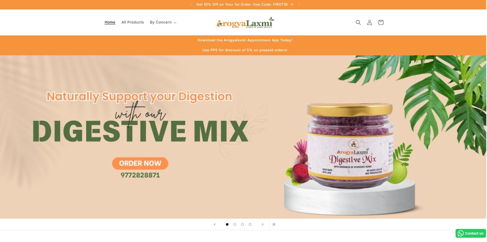
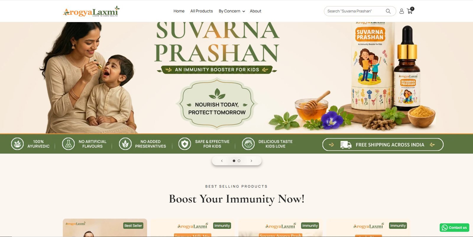
The first frame went from a Digestive Mix banner and a phone number to a Suvarna Prashan lifestyle banner, with a trust strip (100% Ayurvedic, no preservatives, safe for kids, free shipping) directly underneath.
BEFORE
AFTER
SURFACE 02 · BESTSELLERS
A bestseller grid that is actually shoppable
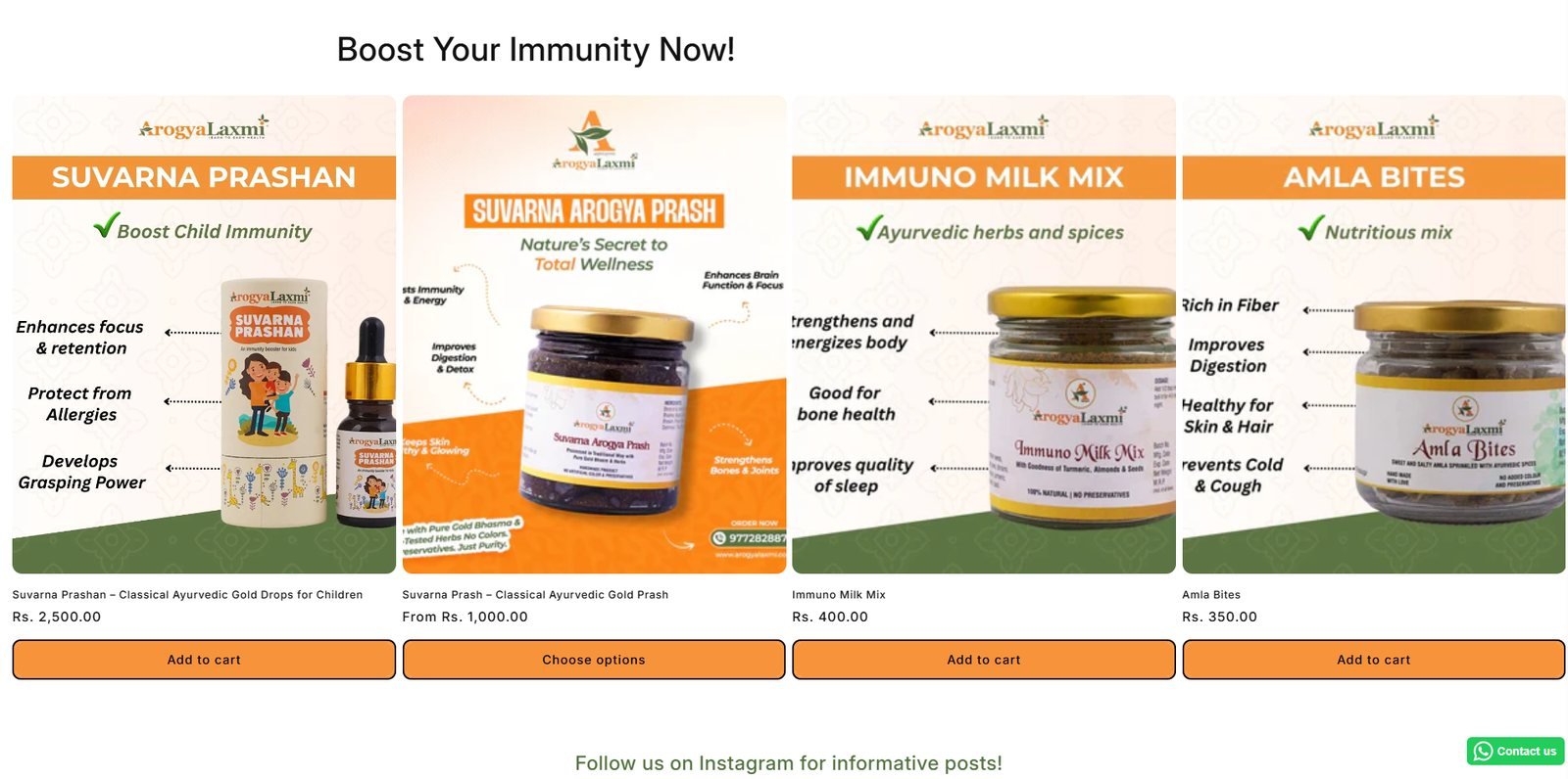
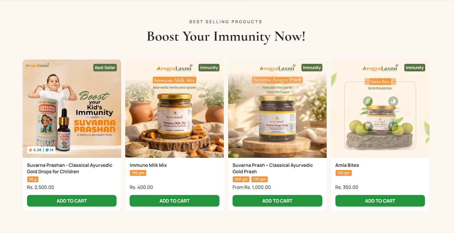
Cards rebuilt with a Best Seller badge, rating and review count, variant chips, price and a direct Add to Cart, so the homepage converts instead of just linking out.
BEFORE
AFTER
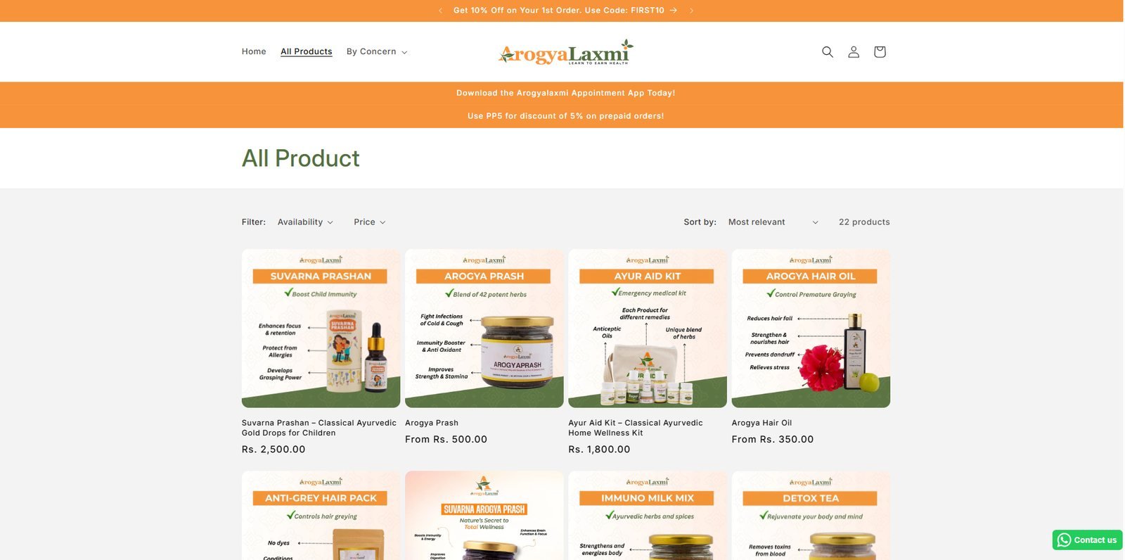
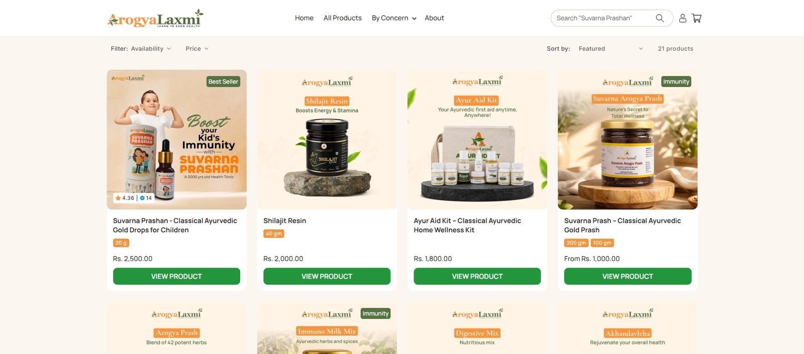
SURFACE 03 · COLLECTION
Collection cards with proof and a clear action
Lifestyle imagery, category badges, ratings on the hero product, variant chips and a full-width View Product button on every card.
BEFORE
AFTER
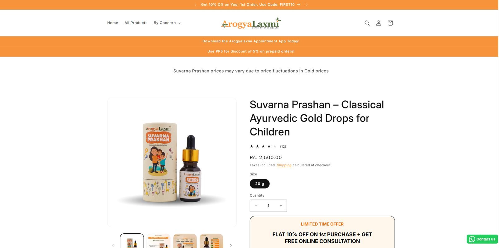
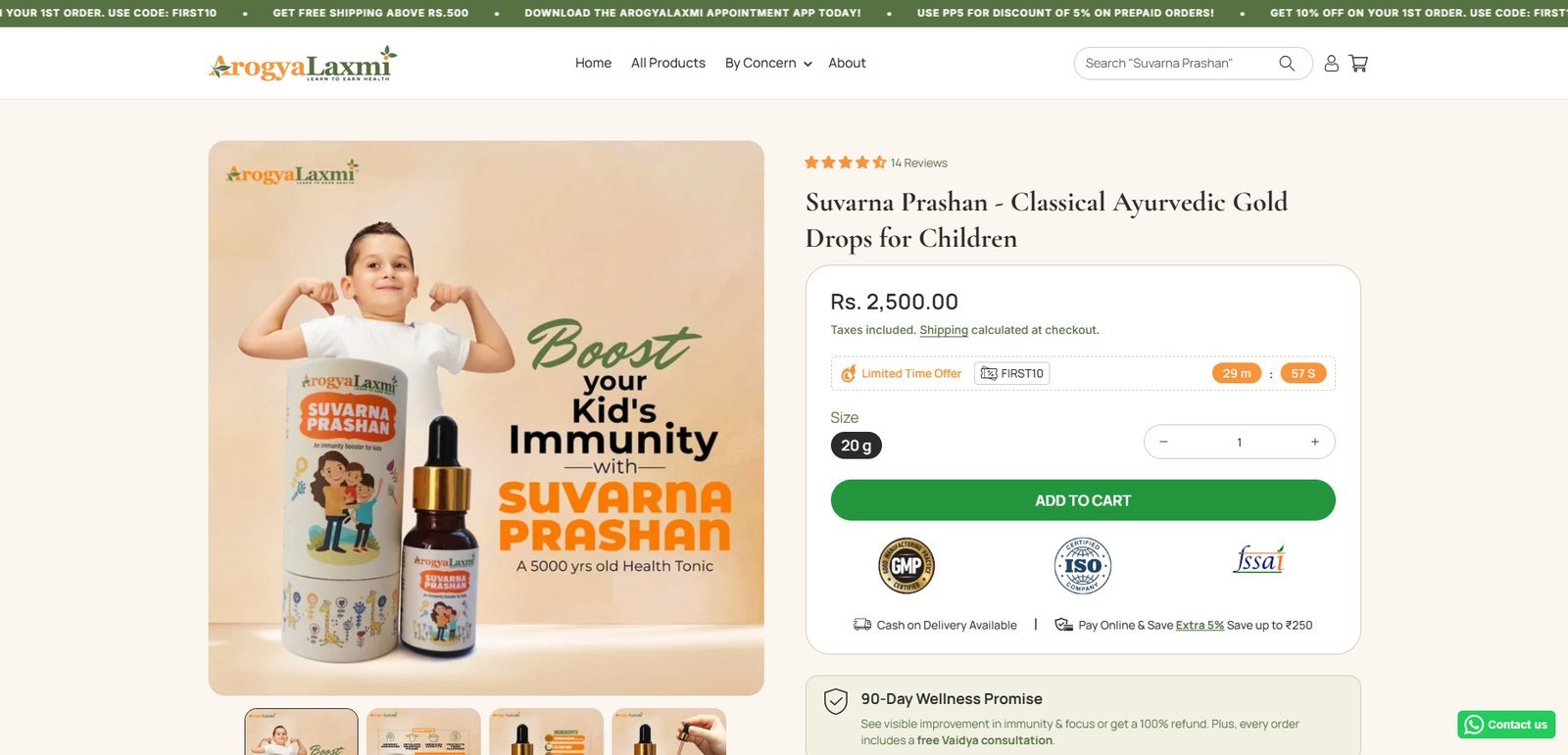
SURFACE 04 · PRODUCT PAGE
A buy box that closes the decision above the fold
Rating moved above the title. Offer with a live timer, GMP, ISO and FSSAI certifications, COD availability and the prepaid saving all sit inside the first screen, followed by the 90-Day Wellness Promise.
BEFORE
AFTER
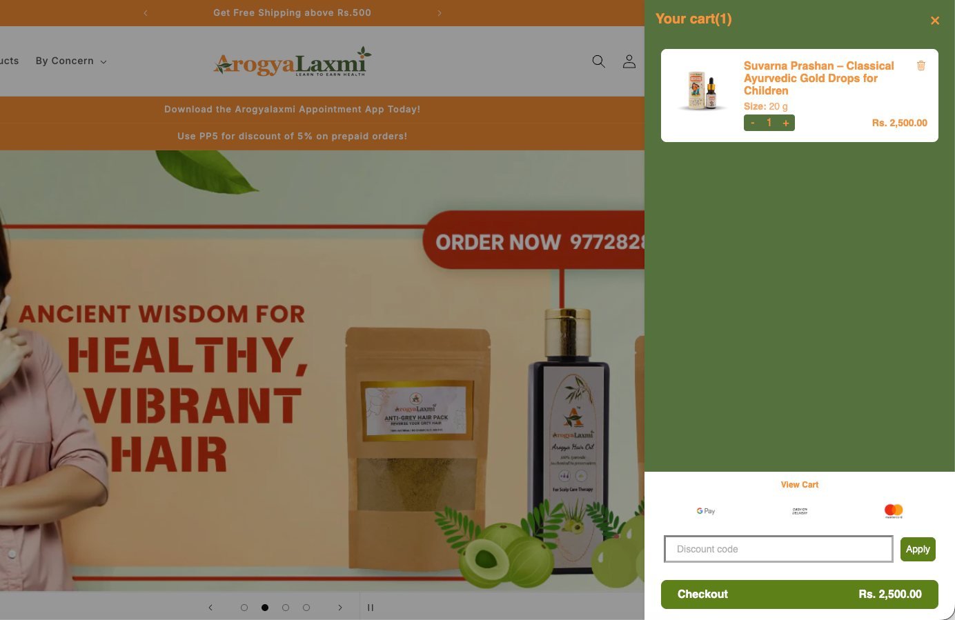
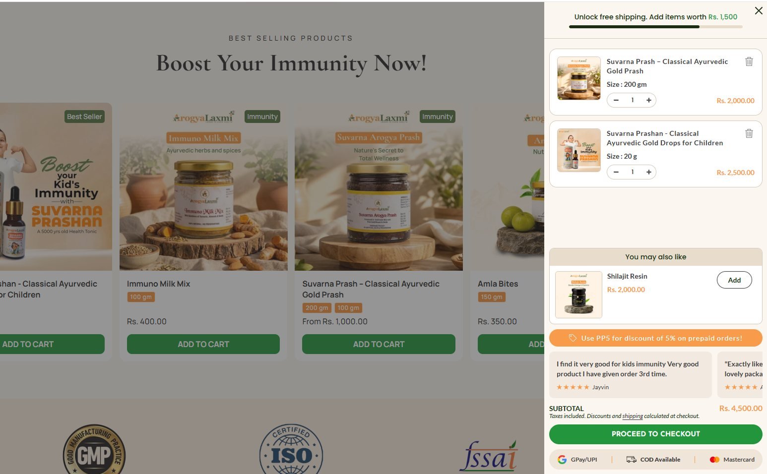
SURFACE 05 · CART DRAWER
A cart drawer that keeps selling
An empty panel with a discount field became a free-shipping progress bar, a you-may-also-like upsell, the PP5 prepaid prompt, customer reviews and payment badges next to checkout.
BEFORE
AFTER
Hierarchy, not decoration. No rebrand and no new catalogue. Every change answered a specific research finding from the diagnosis.
At a glance
BEFORE
✕
Homepage hero led with Digestive Mix and a phone number
✕
Bestseller cards with weak CTAs, no ratings
✕
Collection grid with no social proof
✕
Offer, certs, COD and warranty below the fold on PDP
✕
Cart drawer: an empty panel with a discount field
✕
No reassurance next to the checkout button
AFTER
✓
Suvarna Prashan lifestyle banner and trust strip
✓
Shoppable bestseller grid with ratings and Add to Cart
✓
Collection cards with CTAs and proof
✓
Buy box with offer, certs, COD and warranty in the first screen
✓
Free-shipping progress, upsell and prepaid prompt in cart
✓
Reviews placed right next to checkout
04
THE RESULT
A clearer path from first frame to paid order.
Measured in Shopify Analytics across matched seven-day windows, before and after the rebuilt pages went live. Completed-checkout conversion moved from 0.24% to 1.55%, with a far higher share of shoppers who reached checkout actually finishing.
BEFORE · BASELINE 7 DAYS
0.24%
Shopify conversion rate with the original homepage, collection, PDP and cart drawer
AFTER · MATCHED 7 DAYS
1.55%
Shopify conversion rate with all five rebuilt surfaces live
Sessions grew in the after window too, but that is mostly traffic. The conversion work shows up in the rate, not the visitor count, and the rate is the number we hold ourselves to.
+1.31pp
Absolute lift in Shopify conversion rate
6.5×
Conversion rate vs. the baseline window
100% mobile
Every completed order in the after window came from a mobile device
05
SCOPE AND CONTEXT
What this was, and what it was not.
Seven-day windows are short. A longer observation period will confirm how much of this lift holds. What the data does show is that the same catalogue, sold to the same kind of visitor, converted far more often once the store was organised around the product people already came for.
Every change went to staging first and was QA'd on iOS Safari and Android Chrome before going live, with GA4 and Shopify tracking verified before the baseline was recorded.
Next: a longer observation window, then targeted iteration on the surfaces where the funnel data shows remaining drop-off.
WHAT THIS ENGAGEMENT DID NOT INCLUDE
— No rebrand or visual identity change: layout and hierarchy only
— No new products or catalogue changes
— No A/B test: a directional change with matched before/after windows
— No claim on traffic growth: the result we report is the conversion rate
— No revenue guarantees: Hopiant commits to execution quality and measurement integrity
PHASE 1 — DIAGNOSIS
Audit and foundation
Theme, app and script audit. GA4 and Meta Pixel verified, baseline metrics documented.
PHASE 2 — BUILD
Homepage to cart
Five surfaces rebuilt around Suvarna Prashan. 0.24% to 1.55% conversion.
PHASE 3 — OBSERVE
Observation and iteration
Longer measurement window, then targeted fixes driven by funnel data.
Working on a D2C Shopify store with a conversion problem?
Diagnosis first, development second, measurement throughout. Book a call and we will tell you honestly whether we can help.